Getting Started with Tailwind CSS in Malaysia
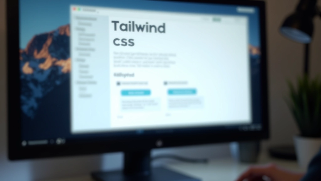
Learn how to set up Tailwind CSS on your projects, customize configurations, and build responsive designs faster than traditional CSS approaches.
Read MoreMaster Tailwind CSS, Bootstrap, CSS Grid, and Flexbox — the essential tools for building responsive, professional websites in Malaysia and beyond.
Whether you’re just starting out or refining your skills, these resources cover everything from foundational layout concepts to advanced framework techniques. We’ve compiled guides, tutorials, and best practices to help you build faster and smarter.

Explore in-depth articles on CSS frameworks, layout systems, and modern styling techniques.
Learn how to set up Tailwind CSS on your projects, customize configurations, and build responsive designs faster than traditional CSS approaches.
Read More
Understand the 12-column Bootstrap grid, responsive breakpoints, and how to create flexible layouts that adapt to any screen size.
Read More
Compare two-dimensional grid layouts with one-dimensional flexbox. Learn which layout method suits your design, with real-world examples.
Read More
Deep dive into justify-content, align-items, gap, and flex properties. Build flexible, centered layouts without hacks or workarounds.
Read MoreQuick reference for the most popular CSS frameworks in web development today.
Utility-first CSS framework that lets you build designs without leaving your HTML. Highly customizable and perfect for rapid prototyping.
Component-based framework with pre-built UI elements. Great for teams and projects where speed and consistency matter most.
Native CSS layout module for two-dimensional designs. No framework needed — use the power of modern browsers directly.
One-dimensional layout module perfect for components and flexible spacing. The foundation of modern responsive design.
Don’t default to the same framework for every project. Consider your timeline, team expertise, and design requirements before deciding.
Most frameworks are highly customizable. Take time to configure them for your brand rather than fighting against the framework’s defaults.
Before jumping into frameworks, understand core CSS concepts — layout, specificity, cascade, and responsive design principles are essential.
Monitor your CSS bundle size, remove unused styles, and leverage modern techniques like CSS-in-JS or utility purging to keep files lean.
Frameworks evolve quickly. Keep your dependencies current and review official documentation regularly for new features and improvements.
Create component libraries and design systems. Consistency across projects saves time and makes maintenance much easier for your team.