Getting Started with Tailwind CSS in Malaysia
Learn how to set up Tailwind CSS on your projects, customize configurations, and build responsive layouts faster than ever.
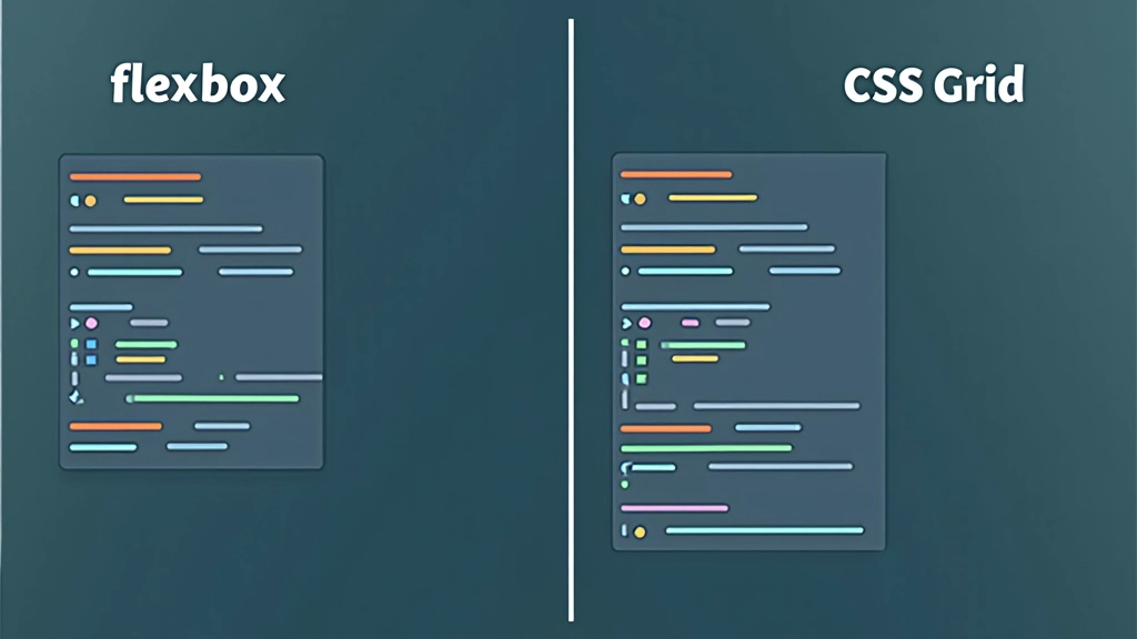
Read ArticleLearn the fundamental differences between two-dimensional grid layouts and one-dimensional flexbox. We’ll explore real-world scenarios and show you exactly when to reach for each tool.

You’re building a new component. The design looks good, but now comes the hard part — how do you actually code the layout? Flexbox or Grid? It’s probably the most common question we see in Malaysian development communities, and honestly, the answer isn’t always obvious.
Here’s the thing: both tools are incredible, but they’re designed for fundamentally different problems. Grid handles two-dimensional layouts — think dashboard grids, card galleries, page templates. Flexbox excels at one-dimensional flow — navigation bars, button groups, content alignment. Using the wrong tool doesn’t break anything, but it makes your code harder to maintain and your layout trickier to adjust later.
We’ve built dozens of projects using both, and we’re going to show you exactly how to choose. By the end of this guide, you’ll know instantly which tool fits your design.
Flexbox thinks in a single direction. You decide if items flow left-to-right or top-to-bottom, then it distributes space along that axis. It’s brilliant for components where you’re aligning items in a line — navigation bars, button groups, centered content.
Here’s what makes Flexbox special: it’s incredible at distribution and alignment. Want to space items evenly? Use `justify-content: space-between`. Need perfect vertical centering? That’s `align-items: center`. These simple properties solve problems that took hacky workarounds for years before Flexbox existed.
The real power comes when you combine properties. A navbar might use `display: flex`, `justify-content: space-between` for spacing, and `align-items: center` for vertical alignment. That’s three lines of CSS replacing what used to be floats, positioning hacks, and table layouts.
Grid thinks in two dimensions simultaneously. You define columns AND rows, then place items at specific intersections. It’s perfect for page layouts, dashboard grids, image galleries — anything where you’re controlling position on both axes at once.
The magic of Grid is the `grid-template-columns` property. You can say “give me three columns of equal width” with just one line: `grid-template-columns: repeat(3, 1fr)`. That’s it. Every item automatically falls into place. Need columns that are 200px, flexible space, then 150px? Grid handles that too: `grid-template-columns: 200px 1fr 150px`.
What really sets Grid apart is placement precision. You can explicitly place items: “Put this image at column 1, spanning 2 columns, and row 2, spanning 3 rows.” You can’t do that with Flexbox. Grid gives you architectural control.

Let’s break down the key differences in practical terms.
Let’s walk through actual situations you’ll encounter. These examples are from projects we’ve built for Malaysian startups and enterprises, so they’re genuinely practical.
You’re building a product listing page. The design shows 3 columns on desktop, 2 on tablet, 1 on mobile. Each product card is the same size. Use Grid here. You’ll define three columns with `grid-template-columns: repeat(3, 1fr)`, and products automatically flow into place. Responsive? Just change the column count in a media query.
You need a navbar with logo on the left, menu items in the middle, and buttons on the right. All items need vertical centering. Flexbox is perfect. Use `display: flex`, `justify-content: space-between`, and `align-items: center`. The navbar adapts naturally to different screen sizes without media queries.
A dashboard with a sidebar (200px), main content area, and footer that spans both. Some widgets are 1 column, some are 2. This is pure Grid. You’ll define your grid structure once, then explicitly place each widget at specific grid coordinates. You get pixel-perfect control.

Use this framework when you’re unsure which tool to reach for.
Ask yourself these questions in order:
If yes Grid. If no Flexbox.
If yes Flexbox. Navbars, button groups, centered content all use Flexbox.
If yes and you want automatic wrapping Flexbox with `flex-wrap: wrap`. If yes and you want explicit control Grid.

Here’s something that confuses beginners: you don’t have to choose. The strongest layouts use Grid for page architecture and Flexbox for component details.
A typical modern layout looks like this: Grid handles the overall page (header, sidebar, main, footer). Inside the main content area, you use Grid again for a card layout. But within each card? Flexbox handles the image, title, and button alignment. You’re layering them.
This is actually how professional developers build sites. Grid gives you the big-picture structure. Flexbox handles the details. Together, they’re unbeatable. We’ve built 40+ production sites this way, and it’s never failed us.
Pro tip: Start with Grid for the page layout, then use Flexbox inside components. It’s the pattern that works.
Use Flexbox when you’re aligning items in a single direction. Navigation, buttons, vertical centering — these are Flexbox’s specialty. It’s simple, intuitive, and handles spacing beautifully.
Use Grid when you’re defining page architecture or controlling items on both axes. Dashboards, galleries, page layouts — Grid gives you the precision you need without fighting the tool.
The best layouts use both. Grid for the big picture, Flexbox for the details. This is how production sites work, and it’s actually simpler than trying to force everything into one tool.
This guide focuses on modern browsers where both Flexbox and CSS Grid have excellent support. If you’re supporting Internet Explorer 11 or older mobile browsers, you’ll need additional considerations. For projects requiring broad legacy support, consult current browser compatibility charts before implementing. The techniques described here represent current best practices for contemporary web development.